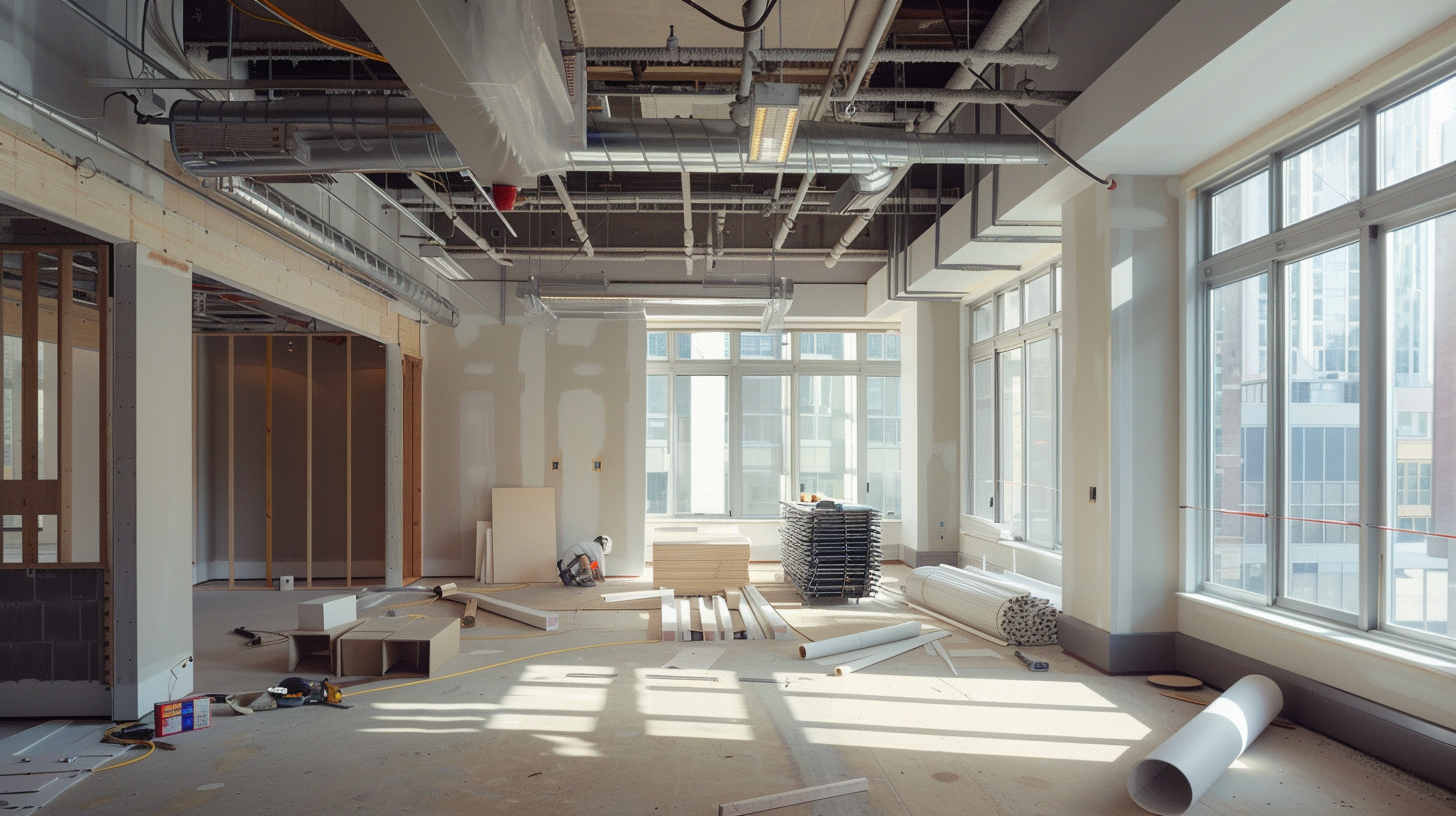
The “clinical white” aesthetic of the 20th-century medical office is obsolete. Modern healthcare design recognizes that the patient experience begins the moment they step through the door. At DIG, we utilize evidence-based design principles, specifically color psychology, to reduce patient anxiety and improve perceived quality of care.
The Science of Warmth
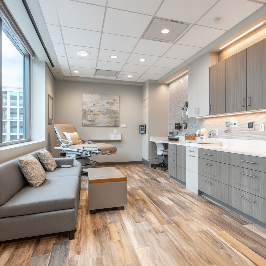
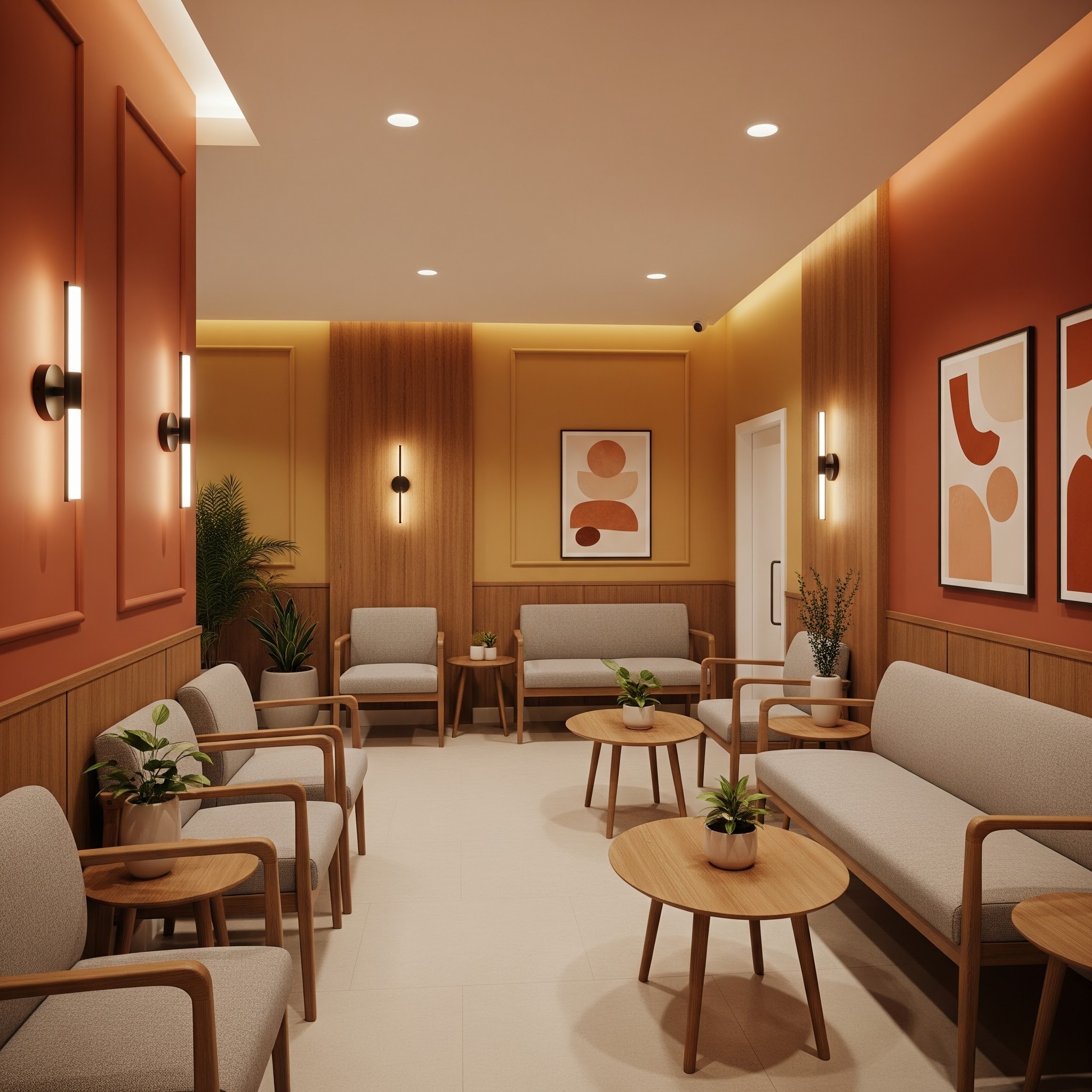
While blue and cool tones are often cited for their calming properties, an over-reliance on them can make a space feel sterile or cold—qualities that exacerbate anxiety in a medical setting. Warm color schemes (soft terracottas, muted ochres, and warm woods) trigger a different psychological response: comfort and security.
Application in Healthcare Settings
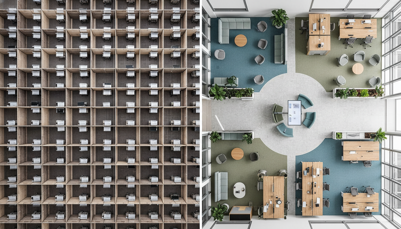
- The Reception Area: This is a high-stress zone. Integrating warm wood tones and soft, earth-toned upholstery creates a “resimercial” (residential + commercial) atmosphere that de-escalates tension.
- Wayfinding: Color is a critical tool for navigation. Using distinct warm accents to denote waiting areas versus clinical zones helps orient patients, reducing the cognitive load and stress associated with getting lost.
Case Study: The Balance
In our Spa & Wellness Center projects, we often balance warm ambient lighting with neutral architectural finishes. This ensures the space feels clean (hygienic) without feeling antiseptic. For medical practices looking to update their facility in 2026, moving beyond sterile beige toward a calculated, warm palette is a strategic move for patient satisfaction.