Warm colors do more than brighten a space — they help it feel alive, loving, and lived-in.
For young families, choosing the right color palette isn’t just about style. It’s about energy, mood, and creating an environment where kids feel safe, calm, and inspired.
Here’s how to bring warm tones into every room — with family-friendly tips for blending beauty and function.
🎨 Why Warm Colors Work in Family Homes
Warm tones like peach, terracotta, saffron, blush, and warm beige are linked to comfort and connection. In color psychology, they’re known to:
- Encourage social interaction
- Create feelings of safety and calm
- Boost mood and energy in play-focused spaces
- Soften hard architectural lines
They also help mask minor messes — which every parent can appreciate.
🍼 Nurseries: Gentle Glow
Go for soft, muted versions of warm hues:
- Blush pink + warm ivory
- Pale apricot + natural wood
- Warm beige + buttery yellow
These colors foster calm and make nighttime transitions smoother.
Pro tip: Use matte finishes to reduce glare and keep the room restful.
🎒 Kids’ Bedrooms: Cozy & Expressive
Add personality with bolder choices, but keep the base grounded:
- Terracotta accent walls behind beds or play tables
- Warm-toned murals with nature or abstract themes
- Rust or coral textiles to add depth without overstimulation
Layer in cool tones as accents (like navy or teal) to create contrast and keep the room evolving as your child grows.
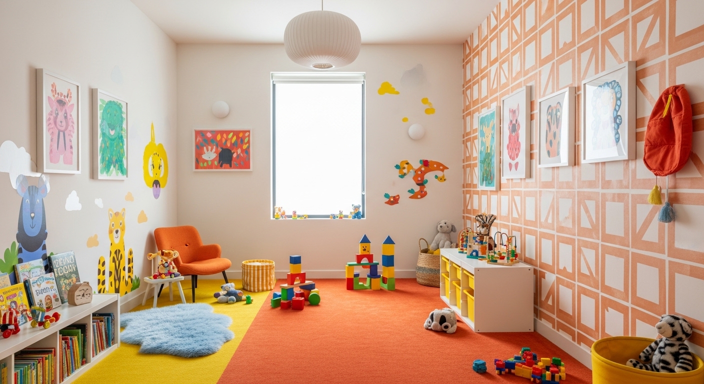
🎨 Playrooms: Energy Zones
Play spaces are the perfect place to go bold:
- Goldenrod and pumpkin tones energize without overwhelming
- Burnt orange + dusty pink feels cheerful yet modern
- Layered primary colors with warm undertones (think golden yellow, tomato red)
Consider using color to zone the space: one wall for art, one for reading, one for movement.
🛋 Shared Living Areas: Family-Friendly Sophistication
Warm tones work beautifully in shared spaces, too — especially when paired with natural textures:
- Cognac leather + soft clay walls
- Brass fixtures + walnut furniture
- Creamy linen upholstery + warm beige paint
These combos feel elevated yet inviting — perfect for family life that doesn’t want to sacrifice style.
DIG’s Take: Color Is a Tool for Togetherness
At DIG, we believe color should support the way your family lives. We don’t just choose swatches — we listen to your rhythm, your routines, and your hopes for how a space should feel.
Warm palettes are one of our favorite ways to design homes that hold more than furniture — they hold connection.