What Are Warm Colors?
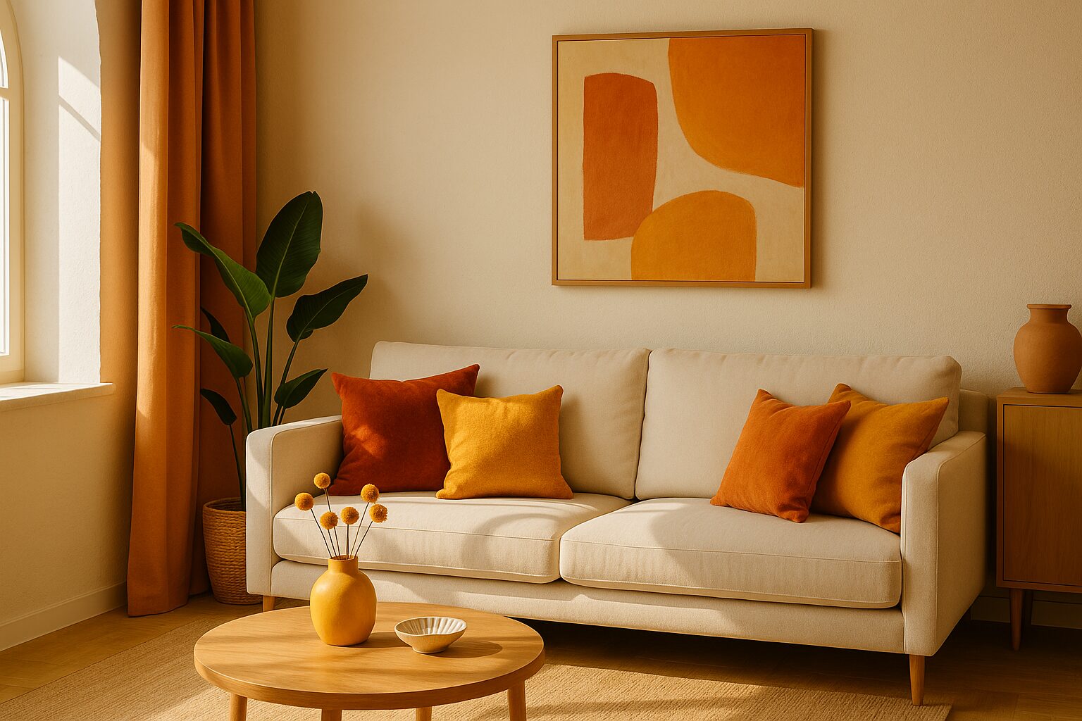
In interior design, “warm colors” refer to hues on the red, orange, and yellow side of the color wheel. Think of the glow of a sunset, the flicker of candlelight, or the cozy tones of autumn leaves — these colors naturally evoke warmth, energy, and comfort.
Warm colors include:
- Red
- Orange
- Yellow
- Variants like rust, terracotta, coral, and gold
They are often associated with fire, sunlight, and physical warmth — which is why they can instantly make a room feel more welcoming or lively.
How Warm Colors Affect Mood
Color psychology suggests that warm colors can:
- Energize a space (think bold reds or bright oranges)
- Create intimacy (deep, rich tones like burgundy or burnt sienna)
- Stimulate conversation and appetite (which is why restaurants love warm palettes)
- Make large spaces feel cozier
However, when overused, some warm tones — particularly bright reds or yellows — can feel overwhelming or agitating. The key lies in balance and intentionality.
Using Warm Colors in Residential Spaces
- Living Rooms: Warm tones like mustard or caramel can create a cozy, lived-in atmosphere — especially when paired with wood or textured materials.
- Kitchens: Burnt orange, deep red, or golden accents stimulate appetite and conversation.
- Bedrooms: Consider muted warm tones like peach or clay to promote relaxation without dullness.
Using Warm Colors in Commercial Design
- Hospitality Spaces: Warm tones enhance comfort and can make dining areas feel more inviting.
- Wellness Centers: Earthy warm colors like terracotta or ochre promote grounding and calm.
- Retail Environments: Pops of warm color can direct attention or create zones of emotional warmth without distracting from product focus.
How to Incorporate Warm Colors Like a Designer
- Use Warm Tones as Accents: A single wall, piece of furniture, or art piece can shift the whole feel of a room.
- Balance With Neutrals: Pair warm tones with beige, cream, or gray to avoid overstimulation.
- Play With Texture: Warm colors feel even richer when paired with natural textures — wood, leather, linen.
- Layer in Lighting: Warm bulbs enhance the natural glow of warm tones, especially at night.
Final Thought: Warm Colors Speak Without Words
At DIG Interior Design Solutions, we believe color isn’t just visual — it’s emotional. Warm colors can ground a space, uplift a room, and influence how people feel the moment they walk in. Whether you’re redesigning your home or refining a commercial space, understanding how to use warm tones with intention is a powerful design tool.
Ready to bring warmth and energy into your space?
Contact DIG Interior Design Solutions to start your project today.