In the world of interior design, color is a language. It has the power to change our mood, alter our perception of a room’s size, and create a specific atmosphere. As we move deeper into fall and winter, you’ll hear designers talk endlessly about “warming up” a space. But what are the warm colors in interior design, and how do they work?
This guide breaks down the fundamentals of warm colors and how you can use them to make your home a sanctuary against the cold.
The Color Wheel: Defining Warm Hues
At its simplest, the color wheel is split into two families: warm and cool.
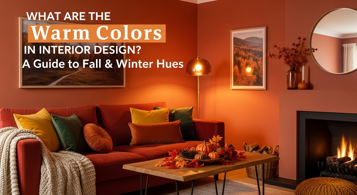
Warm colors are the evocative hues associated with sun, fire, and heat. They are visually stimulating, energetic, and “advancing”—meaning they tend to pop out and make a space feel cozier and more intimate.
The primary warm colors are:
- Red: A color of passion, energy, and drama.
- Orange: A social, fun, and creative color.
- Yellow: The color of optimism, happiness, and sunlight.
From these, we get an infinite spectrum of secondary and tertiary colors like terracotta, rust, mustard, gold, peach, and blush pink.
The Psychology: How Warm Colors Affect Your Mood
Using warm colors is about more than just aesthetics; it’s about feeling.
- Reds and Oranges are fantastic for social spaces. They stimulate conversation and appetite, making them perfect for dining rooms or kitchens. A deep, rusty red can create a dramatic, enveloping library, while a bright orange can bring playful energy to a living room.
- Yellows and Golds are welcoming and uplifting. A soft, buttery yellow can be a classic, cheerful choice for a kitchen, while a saturated gold accent adds a touch of luxury and brightness to any room.
Beyond the Basics: Warm Neutrals
Not all warm rooms are painted bright red. The true secret of professional designers lies in mastering warm neutrals. These are the versatile, foundational colors that provide warmth without overwhelming the senses.
- Warm Whites: Look for whites with a creamy or ivory undertone, rather than a blue or sterile one.
- Beige & Cream: The classic warm neutrals. They provide a perfect, soft backdrop for other warm-toned woods and textiles.
- “Greige”: A popular blend of gray and beige that takes the edge off cool gray and provides a sophisticated, warm-neutral foundation.
- Warm Browns: From light camel to deep chocolate, brown is a powerful neutral that anchors a space and pairs beautifully with every other color on this list.
Using Warm Colors for Fall and Winter
As the days get shorter, warm colors can compensate for the lack of sunlight. Consider these strategies:
- Paint an Accent Wall: If you’re not ready to commit to a full room, paint one wall—perhaps behind your bed or sofa—in a deep rust or olive green (a cool color that pairs beautifully with warm tones).
- Focus on Textiles: This is the easiest, lowest-commitment way to add warmth. Think velvet pillows in mustard, a chunky wool throw in burnt orange, or a plush rug with red and beige tones.
- Add Warm Metallics: Swap cool silver and chrome for brass or gold in your light fixtures, cabinet hardware, and decor.
Understanding what the warm colors are gives you the power to consciously craft a home that feels as good as it looks.
Feeling inspired? The experts at DIG Interiors can help you find the perfect warm color palette for your home. Contact us to create your own cozy retreat.