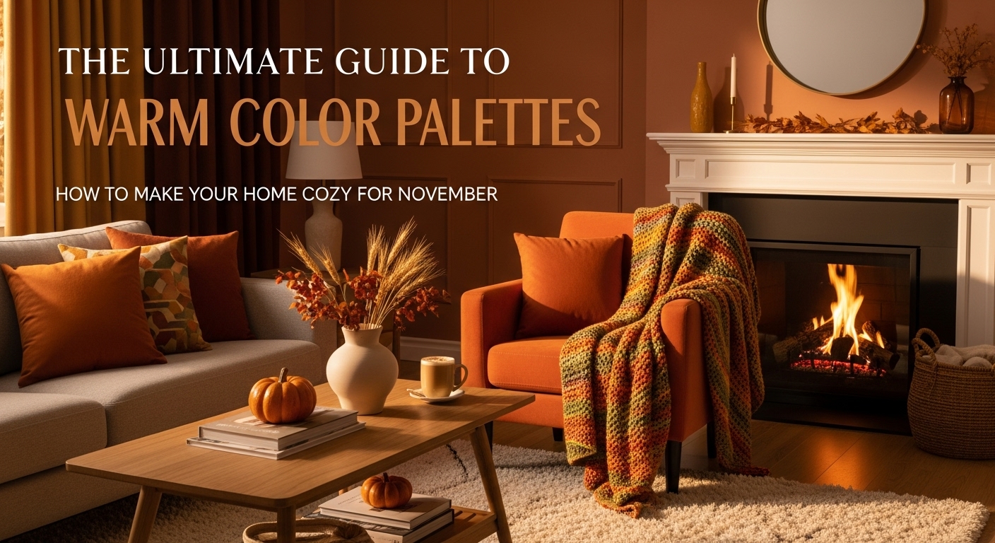
As the November chill sets in, our homes transform into sanctuaries. The key to creating that instant feeling of warmth and comfort? It’s not just about turning up the thermostat—it’s about color. Using a warm color palette is the most effective way to make a room feel like a cozy embrace. This guide will explore how you can leverage these hues to make your home the perfect retreat for fall and winter.
What Exactly Is a Warm Color Palette?
On the color wheel, colors are divided into two categories: warm and cool. Warm colors are the hues associated with sunlight and fire: reds, oranges, and yellows. A warm color palette centers on these colors, along with their various tints, shades, and related neutrals.
Think of terracotta, rust, mustard, gold, beige, and cream. These colors are visually “advancing,” meaning they can make a large, open space feel more intimate and inviting.
How to Build a Warm Palette: The 60-30-10 Rule
A successful color palette needs balance. The 60-30-10 rule is a timeless design principle that helps you get it right.
- 60% (Main Color): This is your dominant color, typically used on the walls. A soft beige, warm white, or light terracotta can create an enveloping backdrop.
- 30% (Secondary Color): This color supports the main hue and is often used for furniture, curtains, or an accent wall. A rich rust, deep olive green (which pairs beautifully with warm tones), or a medium wood tone works well here.
- 10% (Accent Color): These are the pops of color found in pillows, throws, art, and decor. This is where you can be bold with a splash of mustard yellow, deep red, or burnished gold.
Three Timeless Warm Palettes for November
Ready to get started? Here are three palettes perfect for a cozy November refresh:
1. The Earthy Cocoon
- Main: Warm Beige or “Greige”
- Secondary: Terracotta or Rust
- Accent: Deep Forest Green
This palette is grounded, sophisticated, and deeply connected to nature. It’s perfect for a living room or bedroom where relaxation is the priority.
2. The Spiced & Sophisticated
- Main: Cream or Soft White
- Secondary: Rich Brown (like walnut wood)
- Accent: Mustard or Spiced Orange
This high-contrast palette feels both modern and timeless. The spice tones add energy, while the deep browns provide a solid, elegant anchor.
3. The Sunset Glow
- Main: Light, Peachy-Beige
- Secondary: Dusty Rose
- Accent: Burnished Gold or Brass
This is a softer, more romantic take on a warm palette. It’s incredibly inviting and pairs beautifully with layered lighting to create a home that truly glows from within.
It’s Time to Get Cozy
Choosing a warm color palette is the first step toward transforming your home into a cozy haven for the colder months. By balancing these inviting hues, you create a space that doesn’t just look warm—it feels warm.
Ready to bring warmth and sophistication to your space? The interior design team at DIG Interiors specializes in creating palettes that reflect your style. Contact us today to start your design journey.


