Color is more than just a decorative choice; it’s a powerful business tool. In the competitive landscape of New York City and beyond, the right color palette can transform a commercial space from forgettable to magnetic. It can influence customer behavior, boost employee productivity, and create a brand identity that resonates long after a first visit. Among the most effective tools in a designer’s arsenal are warm color palettes.
From the fiery energy of red to the welcoming comfort of beige, warm colors have a profound psychological impact. They can make a space feel more intimate, energetic, and inviting. This guide will walk you through how to leverage the power of warm color palettes to achieve your specific business goals, whether you’re designing a restaurant, a corporate office, or a retail boutique.
The Psychology of Warm Colors in Business Environments
Warm colors—reds, oranges, yellows, and their variations—are known to evoke feelings of happiness, optimism, and energy. In a commercial context, these associations can be harnessed to create a specific atmosphere and encourage desired actions.
- Reds: Associated with passion, excitement, and urgency. In a restaurant, red can stimulate the appetite. In retail, it’s highly effective for highlighting sales and creating a sense of immediacy.
- Oranges: A blend of red’s energy and yellow’s cheerfulness. Orange is welcoming and optimistic, making it an excellent choice for creative office spaces, lobbies, and fitness centers to foster a sense of community and vitality.
- Yellows: The color of sunshine, yellow, is linked to happiness, creativity, and clarity. Softer yellows can make a space feel larger and more welcoming, while bolder shades can be used to grab attention and energize a room.
- Warm Neutrals (Beige, Tan, Terracotta): These foundational colors provide a sense of comfort, stability, and sophistication. They are incredibly versatile and can serve as a calming backdrop for more vibrant accent colors, creating a balanced and professional environment.
Crafting the Perfect Warm Palette for Your Commercial Space
A successful color strategy is never one-size-fits-all. The ideal warm palette depends entirely on the function of the space and the brand identity you wish to project.
For Hospitality: Restaurants, Cafes, and Hotels
In the hospitality industry, the goal is to create an unforgettable experience. Warm palettes excel at making guests feel welcome and comfortable.
- To Create Coziness: Think of a rich, layered palette. Pair deep terracotta or burnt orange walls with plush, cream-colored seating, dark wood furniture, and soft, ambient lighting.
- To Energize a Space: For a vibrant cafe or a fast-casual restaurant, use a bolder approach. Combine mustard yellow with crisp white and black accents for a modern, high-energy feel that encourages social interaction.
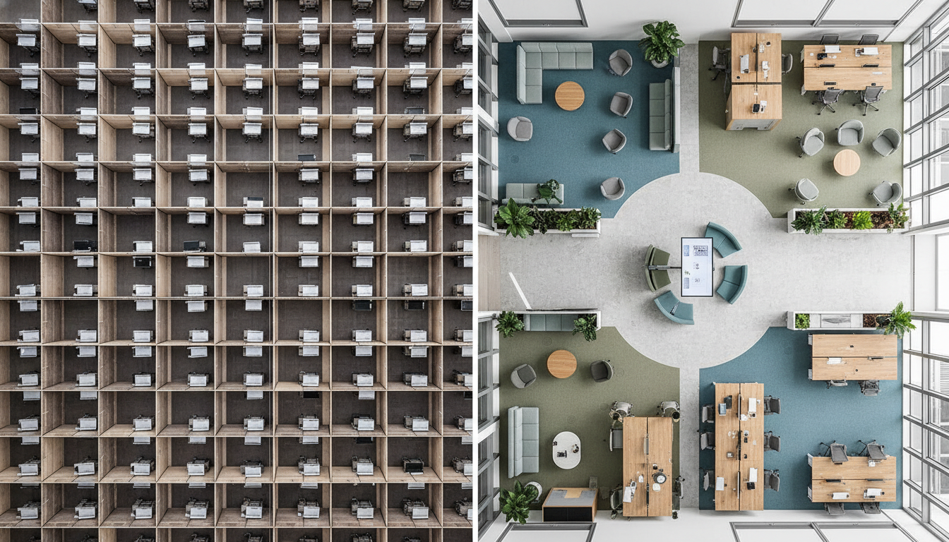
For the Modern Workplace: Corporate Offices and Lobbies
An office should be a hub of productivity and a reflection of company culture. Warm tones can create a more inviting and less sterile work environment.
- For Collaboration: Use muted oranges and warm tans in communal areas and meeting rooms to encourage communication and teamwork.
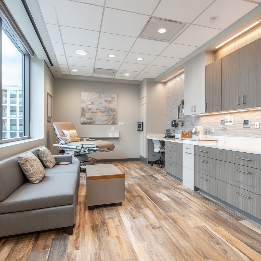
- To Impress Clients: A lobby is the first impression. Craft a sophisticated look by pairing warm gray or beige walls with rich leather seating, brass or gold metallic accents, and elegant wood paneling.
For Retail: Boutiques and Showrooms
In retail, color directs the eye and drives sales. Warm palettes can make a store feel more inviting and create focal points that highlight key merchandise.
- Luxury and Elegance: For a high-end boutique, use a subtle palette of soft peaches, creamy whites, and gold accents. This combination feels sophisticated and allows the products to stand out.
- Urgency and Attention: To draw attention to a new collection or a sales section, use a powerful accent wall in a bold red or orange. This creates a visual destination within the store that customers will naturally gravitate towards.
Beyond Paint: Balancing Warmth with Materials and Textures
An expert application of color goes beyond the walls. To create a truly dynamic and high-end feel, you must balance your warm palette with a thoughtful selection of materials and textures. The right combination adds depth, sophistication, and a tactile quality that paint alone cannot achieve.
- Natural Woods: From light oak to rich walnut, wood brings an organic warmth and timeless appeal that beautifully complements any warm color. It’s perfect for flooring, custom cabinetry, and furniture.
- Rich Metals: Accents of brass, bronze, and copper enhance the luxurious feel of a warm palette. Use them for light fixtures, hardware, and decorative elements to add a touch of modern elegance.
- Supple Leathers: A leather sofa or armchair in a cognac or caramel hue adds a layer of comfort and sophistication, perfect for lounges, lobbies, and executive offices.
- Textured Fabrics: Incorporate depth with fabrics like velvet, wool, and linen in your upholstery and window treatments. A nubby, warm-gray bouclé or a deep red velvet can be a stunning focal point.
Final Thoughts: Ignite Your Brand with Warmth
A well-executed warm color palette is a strategic asset that can significantly impact your business’s success. It helps define your brand, shape your customers’ experience, and create a space where employees can thrive. By thoughtfully combining color, material, and light, you can craft an environment that is not only beautiful but also works hard to achieve your commercial goals.
Ready to transform your commercial space with a color palette that tells your brand’s story? Contact DIG Interior Design today for a consultation and let’s create something unforgettable.