The Science of Color Psychology
Color psychology in office environments extends far beyond aesthetic preferences to directly influence cognitive function, emotional state, and behavioral patterns through measurable neurological responses. In NYC’s high-pressure business environment, where every percentage point of productivity matters, strategic color implementation can deliver competitive advantages that translate directly to bottom-line results.
The human brain processes color information before conscious thought occurs, triggering immediate physiological and psychological responses within 90 seconds of exposure. This pre-cognitive processing means employees experience color’s effects regardless of personal preferences or cultural backgrounds. Neuroscience research using fMRI technology reveals that specific wavelengths of light stimulate distinct brain regions—red activates the amygdala increasing alertness, while blue engages the prefrontal cortex enhancing analytical thinking.
Research from the University of Texas documents that color environments impact performance metrics significantly. Workers in white or gray offices reported feeling more depressed and less energetic compared to those in color-enriched environments. The study found that bland color schemes increased sadness by 25% and reduced energy levels by 30%, directly impacting productivity and engagement. These findings prove particularly relevant for Manhattan offices where winter months already challenge mood and motivation.
Color temperature—the warmth or coolness of hues—influences circadian rhythms and energy levels throughout the workday. Cooler colors with shorter wavelengths (blues and greens) promote morning alertness and sustained focus, while warmer colors with longer wavelengths (oranges and reds) can combat afternoon energy dips. This understanding allows strategic color placement supporting natural productivity cycles rather than fighting against them.
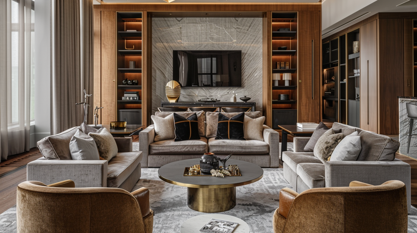
At DIG Interior Design Solutions, our color strategy development considers NYC’s unique environmental factors: limited natural light in canyon-like streets, seasonal affective challenges during long winters, and the visual noise of urban environments requiring careful contrast management. Our Tabernacle Steakhouse project demonstrated how sophisticated color palettes create ambiance while maintaining functionality—principles directly applicable to corporate environments.
Productivity-Enhancing Colors
Scientific research consistently identifies specific colors that measurably improve workplace productivity, with effects varying based on task type, duration of exposure, and environmental context. Understanding these color-performance relationships enables strategic implementation targeting specific business objectives.
Blue: The Productivity Powerhouse
Blue consistently ranks as the most productive color for office environments, particularly for tasks requiring sustained mental effort and accuracy. Research from Creighton University found that workers in blue offices completed tasks 25% faster with fewer errors compared to white environments. Blue’s shorter wavelength stimulates the mind while maintaining calm, creating ideal conditions for focused work.
The specific shade of blue matters significantly. Lighter blues (Pantone 5425C range) promote creativity and open thinking, making them ideal for brainstorming areas. Medium blues (Pantone 2925C) enhance concentration without causing eye strain, perfect for workstations. Darker blues (Pantone 289C) convey stability and trust, appropriate for conference rooms and executive offices. Our Financial District projects consistently utilize blue’s productivity benefits while maintaining professional aesthetics.
Green: The Balance Creator
Green occupies the middle of the visible spectrum, requiring minimal eye adjustment and reducing fatigue during extended work periods. Studies show that workers with green elements in their visual field experience 20% less eye strain and maintain concentration 15% longer than those in neutral environments. This makes green particularly valuable for NYC offices where screen time often exceeds 8 hours daily.
Natural green tones (Pantone 7740C range) connect to biophilic design principles, amplifying benefits when combined with living plants. Sage greens (Pantone 5665C) create calming environments ideal for high-stress departments. Vibrant greens (Pantone 375C) energize without overwhelming, suitable for creative teams. Our healthcare sector projects successfully use green to reduce patient anxiety—benefits equally applicable to reducing workplace stress.
Yellow: The Innovation Catalyst
Yellow stimulates creativity and energy but requires careful application to avoid overwhelming sensitive individuals. Research indicates that yellow environments increase creative output by 13% but can increase anxiety if overused. Strategic yellow accents rather than full walls optimize benefits while minimizing drawbacks.
Soft yellows (Pantone 1205C) work well in collaboration spaces, encouraging open communication and idea generation. Golden yellows (Pantone 130C) add warmth to north-facing NYC offices lacking natural sunlight. Limit yellow to 10-15% of visual field to maintain energy without causing agitation. Our Brooklyn startup projects successfully use yellow accents to maintain energy in industrial spaces.
Orange: The Enthusiasm Builder
Orange combines red’s energy with yellow’s optimism, creating environments that promote enthusiasm and interaction. Studies show orange environments increase social interaction by 18% and improve team collaboration scores by 12%. However, orange can be overwhelming in large doses, making it ideal for accent applications rather than primary colors.
Burnt orange (Pantone 1525C) adds sophistication while maintaining warmth, appropriate for reception areas creating welcoming first impressions. Peach tones (Pantone 162C) soften orange’s intensity while preserving energy, suitable for break rooms and casual meeting spaces. Terra cotta shades connect to natural materials, supporting biophilic design strategies we implement across projects.
Department-Specific Color Strategies
Different departments within organizations require distinct color strategies optimized for their specific functions, work styles, and performance objectives. This targeted approach maximizes color psychology’s benefits while avoiding one-size-fits-all solutions that compromise effectiveness.
Executive Offices and Boardrooms
Leadership spaces require colors conveying authority, stability, and sophistication while supporting decision-making and strategic thinking. Deep blues (Pantone 2768C) promote analytical thinking crucial for strategic planning. Rich grays (Pantone 425C) provide neutral backdrops preventing distraction during critical discussions. Burgundy accents (Pantone 505C) add warmth and prestige without overwhelming.
Wood tones and leather textures complement color schemes while adding natural elements proven to reduce stress during high-stakes meetings. Our Midtown executive suite renovations consistently receive praise for balancing authority with approachability through strategic color selection.
Creative Departments and Design Studios
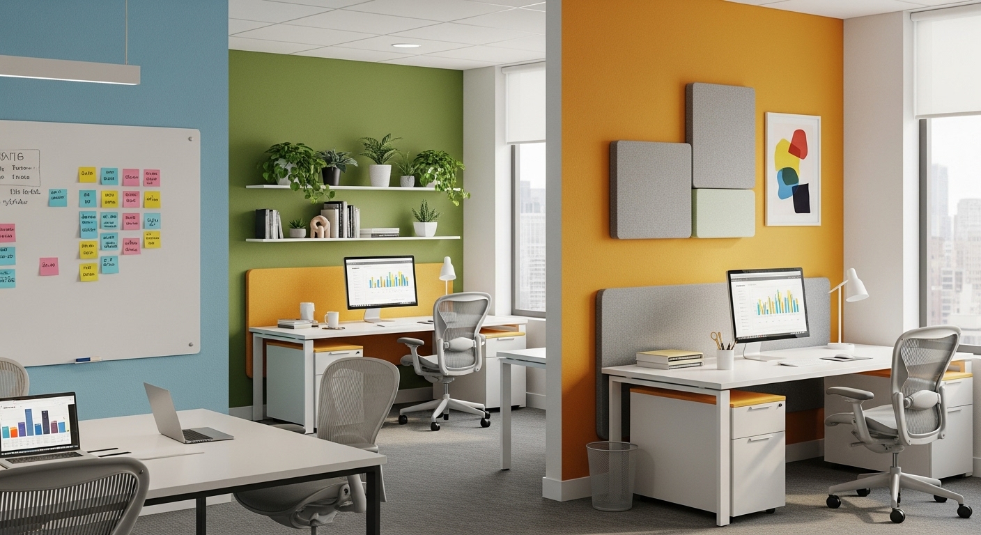
Creative teams benefit from dynamic color environments stimulating innovation while preventing sensory overload. Purple (Pantone 2685C) enhances creative thinking by 15% according to design industry studies. Teal (Pantone 3262C) balances creative energy with focus necessary for execution. Coral accents (Pantone 170C) add unexpected elements triggering novel associations.
Color-changing capabilities through smart lighting or modular panels allow teams to adjust environments based on project phases—energizing colors for brainstorming, calming hues for detailed work. Our advertising agency projects in Chelsea demonstrate how flexible color strategies support diverse creative processes.
Finance and Accounting Departments
Precision-focused departments require colors supporting sustained concentration and accuracy while minimizing fatigue during repetitive tasks. Medium blue (Pantone 2935C) maintains alertness without causing anxiety. Soft gray-greens (Pantone 5517C) reduce eye strain from extended screen use. White and light gray backgrounds ensure maximum contrast for reading numbers and detailed documents.
Avoid red in calculation-intensive areas as studies show it increases error rates by 12% due to stress associations. Our Staten Island financial services projects achieve optimal balance between professional appearance and performance enhancement through carefully calibrated color palettes.
Sales and Customer Service Areas
High-energy departments benefit from colors promoting enthusiasm and positive communication. Energetic greens (Pantone 361C) maintain optimism during challenging calls. Warm yellows (Pantone 116C) support friendly vocal tones crucial for customer interaction. Orange accents (Pantone 151C) boost energy during long shifts.
Consider acoustic implications—darker colors absorb sound, reducing noise transmission in open call center environments. Our client service center designs balance energy-promoting colors with practical acoustic management needs.
Human Resources and Wellness Spaces
HR departments require colors promoting trust, openness, and calm during potentially sensitive conversations. Soft blues (Pantone 5415C) create non-threatening environments encouraging honest communication. Warm neutrals (Pantone 4545C) provide comforting backgrounds without distraction. Green accents connect to growth and development themes central to HR functions.
Wellness rooms and meditation spaces benefit from deeper blues and purples promoting relaxation and introspection. Our Bronx wellness center project demonstrates how color supports various wellness activities from energetic fitness to calming meditation.
NYC Office Lighting Considerations
New York City’s unique lighting challenges—from shadow-casting skyscrapers to seasonal variations in daylight hours—significantly impact how colors appear and perform in office environments. Understanding these interactions enables strategic color selection that maintains effectiveness across changing conditions.
Daylight Variations and Color Rendering
Manhattan’s urban canyon effect creates dramatic lighting variations even within single offices. North-facing windows receive consistent but cool light, making warm colors appear muted. South-facing exposures experience extreme shifts from intense morning light to shadowed afternoons. East and west orientations deal with blinding glare requiring careful color selection to maintain visibility.
Colors shift dramatically under different light sources. The same blue appearing vibrant under daylight might seem gray under fluorescent lighting. We specify colors under multiple lighting conditions, ensuring consistency throughout the day. Paint manufacturers now offer NYC-specific color collections accounting for our unique lighting challenges.
Winter months when daylight shrinks to nine hours require special consideration. Warmer colors compensate for reduced natural light, maintaining energy when seasonal affective disorder peaks. Our lighting design solutions integrate with color strategies ensuring year-round effectiveness.
Artificial Lighting and Color Interaction
LED technology’s prevalence in NYC offices following Local Law 97 energy requirements creates new color considerations. High-CRI (Color Rendering Index) LEDs above 90 ensure colors appear as intended, crucial for brand consistency and psychological impact. Lower quality LEDs with CRI below 80 distort colors, potentially negating carefully planned psychological benefits.
Color temperature of artificial lighting must align with color palette goals. Cool 5000K lighting enhances blues and greens for morning productivity. Warm 3000K lighting enriches oranges and yellows for afternoon energy. Tunable white systems adjust throughout the day, optimizing color psychology’s benefits while supporting circadian rhythms.
Reflectance and Glare Management
NYC’s glass-clad buildings create complex reflectance patterns affecting interior color perception. External reflections from neighboring buildings can tint interior colors—the green glass of adjacent towers might shift neutral grays toward green. Window films managing glare and heat must be color-neutral to preserve intended psychological effects.
Light reflectance values (LRV) guide color selection for optimal brightness without glare. Workspace surfaces should maintain 50-60% LRV for comfortable viewing. Ceilings at 80-90% LRV maximize light distribution. Accent walls at 20-30% LRV provide visual interest without overwhelming. These technical specifications ensure colors perform functionally while delivering psychological benefits.
Brand Integration with Color
Strategic color psychology must align with corporate brand identity while optimizing productivity—a delicate balance requiring sophisticated understanding of both branding principles and workspace psychology. NYC companies increasingly recognize that internal color environments shape culture as powerfully as external brand colors influence customer perception.
Balancing Brand Colors with Productivity Needs
When corporate colors conflict with productivity optimization, creative solutions maintain brand presence without compromising performance. A financial firm with red brand colors might limit red to entry areas and accent pieces, using productivity-enhancing blues in work zones. Technology companies with stark black-and-white brands incorporate colored lighting or artwork maintaining brand aesthetic while adding psychological benefits.
The 60-30-10 rule provides framework for brand integration: 60% neutral productive colors, 30% brand secondary colors, 10% brand primary as accents. This maintains brand recognition without overwhelming spaces with potentially counterproductive colors. Our corporate rebranding projects demonstrate how evolved color strategies support both brand evolution and workplace performance.
Cultural and Industry Considerations
Industry norms influence color acceptance and effectiveness. Law firms expect conservative palettes conveying stability and trust. Creative agencies embrace bold colors reflecting innovation. Healthcare organizations require calming colors reducing anxiety. Understanding industry-specific color associations prevents disconnect between company image and workspace reality.
NYC’s multicultural workforce requires sensitivity to cultural color associations. While red symbolizes luck in Chinese culture, it signals danger in Western contexts. Green carries positive environmental associations globally but can trigger negative financial associations (“in the red”). Our diverse project portfolio demonstrates successful navigation of cultural color considerations.
Common Color Mistakes
Even well-intentioned color implementations can fail when common mistakes undermine psychological benefits. Understanding these pitfalls—particularly prevalent in NYC’s fast-paced renovation environment—prevents costly errors requiring correction.
Overwhelming Saturation
Highly saturated colors initially energize but cause fatigue with extended exposure. NYC offices often make this mistake attempting to combat urban grayness with intense colors. Studies show productivity drops 15% after two hours in highly saturated environments. Solution: Use saturated colors sparingly as accents, maintaining larger surfaces in balanced mid-tones.
Ignoring Transitions
Abrupt color transitions between spaces create jarring experiences disrupting cognitive flow. Moving from bright yellow collaboration spaces to dark blue focus areas triggers stress responses requiring 10-15 minutes adaptation. Gradual color transitions using bridge colors maintain psychological continuity. Our department-specific layouts incorporate transition zones preventing jarring shifts.
Trend-Chasing Without Strategy
Following color trends without considering psychological impact creates environments that quickly feel dated and potentially counterproductive. Millennial pink might photograph well for social media but lacks productivity benefits for most office functions. Focus on timeless colors with proven psychological benefits, incorporating trends through easily changed accessories.
One-Size-Fits-All Approaches
Applying single color schemes throughout diverse spaces ignores functional requirements. Reception areas need different colors than focus zones. Morning spaces benefit from different palettes than afternoon areas. Our comprehensive approach tailors colors to specific zones while maintaining cohesive overall aesthetics.
Get Your Custom Color Strategy designed specifically for your NYC office’s unique needs and objectives.
Implementation Timeline
Executing a strategic color transformation requires careful planning to minimize disruption while maximizing impact. NYC’s competitive business environment demands maintaining operations during updates, making phased implementation essential for success.
Phase 1: Analysis and Strategy (Weeks 1-2)
Begin with comprehensive color audit documenting existing conditions and their effects. Survey employees about current environment impact on mood and productivity. Analyze natural and artificial lighting patterns throughout typical workdays. Review brand guidelines and cultural considerations. Develop customized color strategy addressing identified issues while supporting business objectives.
Phase 2: Testing and Refinement (Weeks 3-4)
Pilot programs in single departments validate color choices before full implementation. Temporary installations using removable materials allow real-world testing without commitment. Monitor employee feedback and productivity metrics during test periods. Refine selections based on actual versus theoretical performance. This reduces risk and builds organizational buy-in for larger investment.
Phase 3: Implementation Planning (Weeks 5-6)
Develop detailed implementation schedules minimizing business disruption. Weekend and after-hours work maintains operations while transforming spaces. Coordinate with building management for access and compliance requirements. Order materials with adequate lead times preventing delays. Create communication plans keeping employees informed and engaged throughout process.
Phase 4: Execution and Monitoring (Weeks 7-10)
Professional application ensures colors appear as intended—even premium paints fail with poor application. Monitor implementation quality maintaining consistency across spaces. Address issues immediately preventing compounding problems. Document completed work for maintenance reference. Celebrate milestones maintaining momentum and enthusiasm.
ROI of Strategic Color Design
Quantifying color psychology’s return on investment transforms perception from decorative expense to strategic investment. NYC businesses implementing comprehensive color strategies report measurable improvements justifying relatively modest investments.
Productivity Gains
Conservative 5% productivity improvements from optimized color environments generate substantial returns. For 100 employees averaging $75,000 salaries, 5% improvement equals $375,000 annual value. Studies document up to 25% productivity gains in optimal conditions, potentially generating $1.875 million annual value. Color updates costing $50,000-100,000 achieve positive ROI within 2-6 months.
Health and Wellness Returns
Reduced eye strain, fewer headaches, and improved mood decrease sick days and healthcare costs. Companies report 15% reduction in vision-related complaints after color optimization. Decreased stress levels reduce stress-related illness and workers’ compensation claims. Improved workplace satisfaction reduces turnover costs averaging $25,000 per professional departure.
Talent and Brand Benefits
Thoughtfully designed color environments support recruitment and retention efforts. Candidates consistently rate colorful, energetic offices higher than neutral spaces. Employee pride in workspace increases, improving recruitment referrals and online reviews. Clients perceive companies with strategic color use as more innovative and detail-oriented, supporting premium pricing.
Energy and Maintenance Savings
Strategic color selection reduces lighting requirements through improved reflectance. Lighter colors can reduce artificial lighting needs by 15-20%, saving $2-3 per square foot annually. Durable, quality paints reduce repainting frequency from 3-5 years to 7-10 years. Hide wear patterns with strategic color placement reduces maintenance requirements.
Research from MIT and Stanford validates these returns, showing companies investing in evidence-based color strategies achieve 15-20% overall performance improvement. The relatively low cost of paint and application makes color psychology one of the highest ROI workplace investments available.
Get Your Custom Color Strategy and discover your office’s color psychology potential with detailed ROI projections.
DIG Interior Design Solutions specializes in strategic color psychology for commercial spaces throughout New York City. From our Tabernacle Steakhouse project showcasing sophisticated color ambiance to corporate offices across Staten Island and Manhattan, we bring proven expertise in creating color environments that inspire productivity and wellbeing. Contact us to transform your workspace through the power of strategic color design.
Key Research & Frameworks in Office Color Psychology
- Frank Mahnke — author of Color, Environment, and Human Response (1996), the foundational academic text on color’s neurological and psychological effects in built environments; widely cited in commercial interior design practice.
- Faber Birren — 20th-century color psychologist whose industrial color consulting work established evidence for color’s impact on worker productivity, fatigue, and morale — principles still applied in modern commercial design.
- Human Spaces Global Report (Interface) — a landmark study of 7,600 office workers across 16 countries that found workplaces with natural elements (including biophilic color) reported 15% higher creativity and 6% higher productivity scores.
- WELL Building Standard (IWBI) — the International WELL Building Institute‘s Mind concept includes lighting and color guidance to support cognitive function and emotional wellbeing in commercial interiors.
- LEED (Leadership in Energy and Environmental Design) — the U.S. Green Building Council‘s rating system includes Indoor Environmental Quality credits that intersect with color-relevant decisions including daylighting, views, and lighting quality.
- Neuroscience of Color (fMRI research) — Studies using functional MRI imaging have demonstrated that color processing occurs in the brain’s V4 complex within 90 milliseconds of exposure — before conscious perception — confirming that color’s effects on behavior are pre-cognitive and unavoidable.
For NYC commercial real estate tenants and employers, the stakes of office design have never been higher. Gallup’s State of the Global Workplace report consistently links physical work environment quality to employee engagement, with disengaged employees costing U.S. businesses an estimated $450–$550 billion annually in lost productivity. Color is among the most cost-effective levers available — a full repainting and accent strategy for a 5,000 sq ft NYC office typically costs $15,000–$40,000, while the productivity and retention benefits can represent multiples of that investment within a single year. DIG Interior Design’s commercial team applies evidence-based color strategy as part of every workplace design engagement, from initial programming through construction administration and FF&E specification.
Frequently Asked Questions: Office Color Psychology
What color is best for office productivity?
Blue is the most consistently documented color for enhancing focus and analytical productivity — it promotes calm concentration and is ideal for workstations, private offices, and heads-down work zones. Green reduces eye fatigue and promotes steady, sustained effort, making it excellent for open plan environments. The right choice depends on the type of work your team primarily performs.
What color increases creativity in an office?
Yellow and warm orange are most strongly associated with creative thinking, optimism, and idea generation. These colors work well in brainstorming rooms, creative studios, and collaboration zones — but should be used as accents rather than dominant wall colors, as prolonged exposure to high-saturation yellow can cause fatigue and eye strain.
Should an NYC office use white walls?
White and stark neutral offices are associated with creative inhibition and can increase feelings of sterility and low energy — particularly problematic in windowless NYC office environments. A better approach is to use warm off-whites or greige as base tones, then layer in strategic color accents that align with your team’s primary work type. Pure white works best in spaces with abundant natural light.
What color should a conference room be?
Conference rooms benefit from colors that project authority and encourage focused discussion without causing agitation. Deep navy, forest green, and charcoal create a gravitas appropriate for C-suite meetings and client presentations. For innovation-focused rooms, warm mid-tones like terracotta or soft teal encourage open dialogue. Avoid red in conference rooms — it increases tension and can shorten perceived meeting time.
How does office color affect employee wellbeing?
Color directly influences cortisol levels, heart rate, and emotional state — all factors in workplace wellbeing. Biophilic colors (greens, blues, warm earthy tones) reduce stress hormones and support psychological safety. Overly saturated or chaotic color environments increase anxiety and cognitive load. Companies investing in evidence-based color strategies report improvements in employee retention and reductions in reported stress and burnout.
How do I choose an office color palette in NYC?
Start by mapping your team’s primary work modes (focus work, collaboration, client-facing) to dedicated zones, then select colors that optimize each zone independently. Consider your natural light conditions — NYC offices often have limited daylight, making warm artificial lighting and corresponding warm tones essential to avoid a cold, demotivating environment. Work with a commercial interior designer to validate palette choices under your specific lighting plan before committing to finishes.
What is the ROI of office color changes?
Research by the Human Spaces Global Report found that offices designed with natural elements and optimized color performed up to 15% better on creativity measures and reported 6% higher productivity. For a 50-person NYC office, even a 5% productivity gain represents significant annual value. Color is one of the lowest-cost levers in commercial interior design with one of the highest-impact outcomes per dollar spent.