In the fiercely competitive restaurant industry, success is determined by more than just the quality of the food. The most successful establishments understand that they are selling an experience. From the moment a guest walks through the door, every detail contributes to their perception, and no detail is more powerful or immediate than color.
The color palette of your restaurant is a silent host. It influences your guests’ moods, their perception of your brand, how long they stay, and even what they order. A strategic approach to color psychology is one of the most effective tools a restaurant owner can have for creating a memorable brand and a profitable business.
This guide explores the psychological impact of different color families and how to use them to design an unforgettable dining experience.
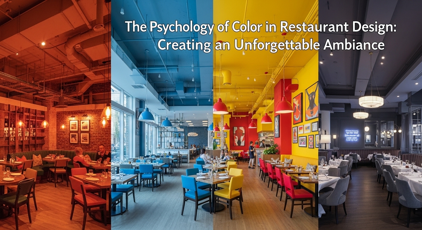
The Power of Warm Colors: Stimulating Appetite and Energy
Warm colors are a classic choice for restaurants for a reason—they are psychologically proven to engage and energize.
- Reds: The most powerful color in the spectrum, red is known to increase heart rate, create a sense of urgency, and, most importantly, stimulate the appetite. It’s why so many fast-food and fast-casual brands use it heavily. In a fine dining context, deeper shades like burgundy or maroon can create an atmosphere of luxury and intimacy.
- Oranges: A more sociable and less aggressive color than red, orange encourages conversation and creates a feeling of warmth and comfort. Terracotta, apricot, and rust tones can make a space feel inviting and are excellent for casual cafes and family-friendly eateries.
- Yellows: Bright and attention-grabbing, yellow is associated with happiness and optimism. It’s effective at catching the eye of passersby and creating a cheerful, energetic vibe. Softer yellows can make a small space feel larger and more welcoming.
The Subtlety of Cool Colors: Eliciting Calm and Trust
While warm colors stimulate, cool colors soothe. They are ideal for creating a more relaxed, upscale, or health-focused environment.
- Greens: The color most associated with nature, green signals health, freshness, and tranquility. It’s a perfect choice for farm-to-table restaurants, health food cafes, or any brand wanting to emphasize fresh ingredients. Olive and sage greens create a sophisticated, calming atmosphere.
- Blues: Blue is one of the most calming colors, evoking feelings of trust and stability. However, it can also act as an appetite suppressant, so it must be used thoughtfully. It works wonderfully in coastal-themed restaurants or as an accent color. Paired with warm woods or metals, navy blue can feel incredibly chic and sophisticated.
- Purples: Historically associated with royalty, purple conveys a sense of luxury, creativity, and quality. Deep eggplants and plums can create a dramatic, high-end feel for a cocktail bar or a creative fine-dining concept.
The Foundation of Neutrals: Sophistication and Flexibility
Neutrals are the backbone of a sophisticated design, allowing food, guests, and accent colors to take center stage.
- Black, Gray, and Charcoal: These colors provide a sleek, modern, and upscale backdrop. They allow vibrant food and art to pop, creating a sense of drama and focus.
- Browns and Beiges: Earthy and grounding, these colors create a rustic, comfortable, and natural atmosphere. They are timeless and form the perfect foundation for layered, textured designs.
- White: Symbolizing cleanliness and simplicity, white can make a space feel bright and airy. It is a staple of minimalist design but needs texture and accent colors to avoid feeling sterile.
Final Thoughts: Your Palette is Your Brand
The colors you choose are a direct extension of your restaurant’s brand identity. A vibrant, high-contrast palette might be perfect for a lively taco bar, while a muted, monochromatic scheme would better suit an exclusive tasting-menu restaurant. The right palette doesn’t just decorate your space—it tells your story, shapes your guest experience, and ultimately, drives your success.
Explore how DIG Interior Design brings color strategy to life in real hospitality projects. Visit our Hospitality Project Portfolio to see how thoughtful palette choices have transformed dining venues across NYC and the Tri-State area — or learn more about our full commercial interior design services.
Key Research & Frameworks in Restaurant Color Psychology
The scientific foundation for color’s influence on dining behavior draws from several established research streams:
- Faber Birren — pioneer of color psychology whose research in the mid-20th century established foundational links between color and appetite stimulation, influencing the fast food industry’s adoption of red and yellow palettes.
- Charles Spence (Oxford University) — professor of experimental psychology whose research on multisensory dining has documented how color affects flavor perception, appetite, and eating pace.
- International Association of Color Consultants (IACC) — the primary professional body for color consultants, providing training and certification standards for practitioners working in hospitality environments.
- Munsell Color System — the standardized color notation system used by interior designers and architects to specify colors with precision; critical for ensuring consistency between design intent and final installation.
- NCS (Natural Colour System) — European color specification standard widely used in hospitality interior specification for Scandinavian-influenced concepts.
The influence of color on restaurant revenue has measurable precedent. Research published in the British Food Journal found that ambient conditions including color temperature and hue directly affected how long diners stayed and how much they spent. Appetite journal has published multiple peer-reviewed studies confirming that warm colors (particularly red) increase eating speed and caloric intake, while cool colors extend dwell time. For NYC restaurant owners competing in one of the most saturated dining markets in the world, these are not soft aesthetic choices — they are measurable business levers. DIG Interior Design’s hospitality team applies color science alongside lighting strategy, material selection, and acoustic design to create dining environments that perform at every service.
Frequently Asked Questions: Restaurant Color Psychology
What colors make people eat more in a restaurant?
Warm colors — particularly red, orange, and yellow — are proven to stimulate appetite and increase the pace of eating, making them popular choices for fast-casual and high-volume dining concepts. Red specifically increases heart rate and creates urgency. Fine dining establishments often use deeper, warmer tones like burgundy, gold, and terracotta for a similar effect with more sophistication.
What color makes people stay longer in a restaurant?
Cool colors — particularly blue, green, and soft purple — encourage guests to linger, making them ideal for bars, wine-forward restaurants, and tasting-menu venues where longer dwell times increase revenue per cover. Earthy neutrals like warm gray and sage also extend dwell time while maintaining a relaxed, unhurried atmosphere.
What is the best color for a restaurant interior?
There is no single “best” color — the right choice depends entirely on your concept, target customer, and revenue model. Fast casual and high-turnover concepts benefit from warm reds and oranges. Fine dining and bars perform better with deep neutrals, jewel tones, or cool palettes. The most effective restaurant color strategies combine an anchor palette (2–3 dominant colors) with accent tones that reinforce brand identity.
Why do so many fast food restaurants use red and yellow?
Red and yellow are used deliberately by fast food brands because red stimulates appetite and creates urgency, while yellow evokes happiness and optimism. Together they trigger quick decision-making and eating — exactly what high-turnover concepts need. This strategy, pioneered by McDonald’s and adopted across the industry, is well-documented in consumer psychology research.
How does lighting interact with restaurant color choices?
Lighting dramatically affects how colors read in a finished space. Warm incandescent or Edison-style lighting (2700–3000K) makes warm wall tones richer and food more appetizing. Cool LED lighting (4000K+) can make the same colors look flat or clinical. Any serious restaurant color strategy must be validated with lighting mockups — a color that looks perfect in a showroom may perform completely differently under your specific fixture plan.
Should a restaurant’s color scheme match its cuisine type?
Generally yes — color should reinforce the culinary story and target customer expectation. Mediterranean restaurants often use terracotta, cobalt, and white to evoke the region. Japanese minimalist concepts lean toward neutral, muted palettes with natural wood. The disconnect between color and cuisine creates cognitive dissonance that can undermine brand credibility, even if guests can’t articulate why.
How do I choose a color palette for my NYC restaurant?
Start with your brand identity and target demographic, then consider the physical constraints of your space — ceiling height, natural light, floor size. Work with a commercial interior designer experienced in hospitality to develop a palette that performs under your specific lighting plan and holds up against the material selections (flooring, upholstery, millwork) that make up the bulk of the guest’s visual experience.
Ready to translate your culinary vision into a powerful physical space? Contact DIG Interior Design to create a color strategy that captivates your guests.