Color is one of the most powerful tools in an interior designer’s arsenal, yet it’s often one of the most misunderstood. In a dynamic NYC workspace, color is not merely a decorative choice; it’s a silent communicator that can profoundly influence mood, behavior, and, most importantly, productivity. Understanding office color psychology for productivity allows businesses to move beyond beige walls and create environments that are intentionally designed to energize, focus, and inspire their teams.
A strategic color palette can transform an office from a bland, uninspiring space into a dynamic engine for collaboration and innovation. By harnessing the psychological impact of color, you can support your employees’ well-being and align your physical space with your company’s strategic goals.
The Psychological Impact of Color in the Workplace
Different colors evoke distinct emotional and psychological responses. By understanding these associations, you can tailor your office environment to support specific types of work and foster a desired company culture.
Blue: The Color of Focus and Calm
Universally associated with logic, communication, and efficiency, blue is an excellent choice for areas that require deep concentration. It has a calming effect on the mind, helping to lower blood pressure and slow heart rates.
- Best for: Individual workstations, accounting departments, engineering teams, and any space where analytical thinking is paramount.
- Shade matters: Lighter blues can feel serene and open, while deeper navy tones convey a sense of stability and expertise.
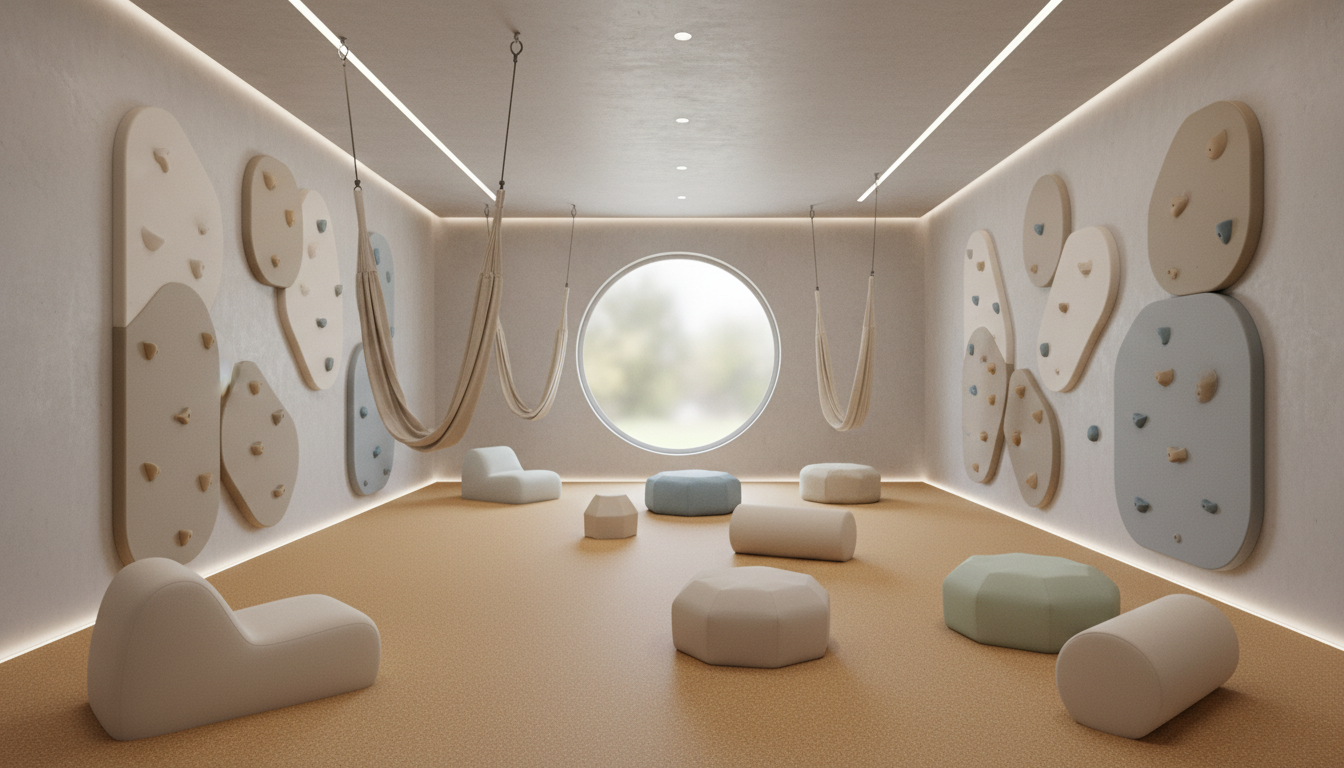
Green: The Color of Balance and Harmony
Green is the easiest color on the human eye and is deeply linked with nature, balance, and restoration. It can reduce eye strain and promote a sense of calm and reassurance, making it ideal for long work hours.
- Best for: Any office environment, breakout spaces, wellness rooms, and areas where employees spend significant time, as it combats fatigue.
- Shade matters: Bright, zesty greens can be energizing, while muted sage and forest greens create a tranquil, grounding atmosphere.
Yellow: The Color of Creativity and Optimism
Yellow is a stimulating and joyful color that sparks creativity, innovation, and optimism. It’s energetic and attention-grabbing, making it perfect for getting the creative juices flowing.
- Best for: Brainstorming rooms, design studios, and collaborative hubs where new ideas are generated.
- Caution: Too much bright yellow can be overwhelming or even anxiety-inducing. Use it strategically as an accent color rather than for entire walls.
Orange: The Color of Collaboration and Enthusiasm
A blend of red’s energy and yellow’s optimism, orange is a social color that encourages communication, collaboration, and enthusiasm. It creates a welcoming and energetic vibe.
- Best for: Common areas, cafeterias, reception areas, and team meeting spaces designed to foster interaction.
- Caution: Like yellow, orange is a high-energy color. It’s often most effective when used in moderation to add a punch of vitality.
Red: The Color of Energy and Passion
Red is a powerful, physically stimulating color that raises heart rates and creates a sense of urgency. While too much can evoke feelings of aggression, a small amount can be used to energize and motivate.
- Best for: Accent walls or furniture in areas where physical activity or decisive action is needed. It is generally not recommended for main work areas.
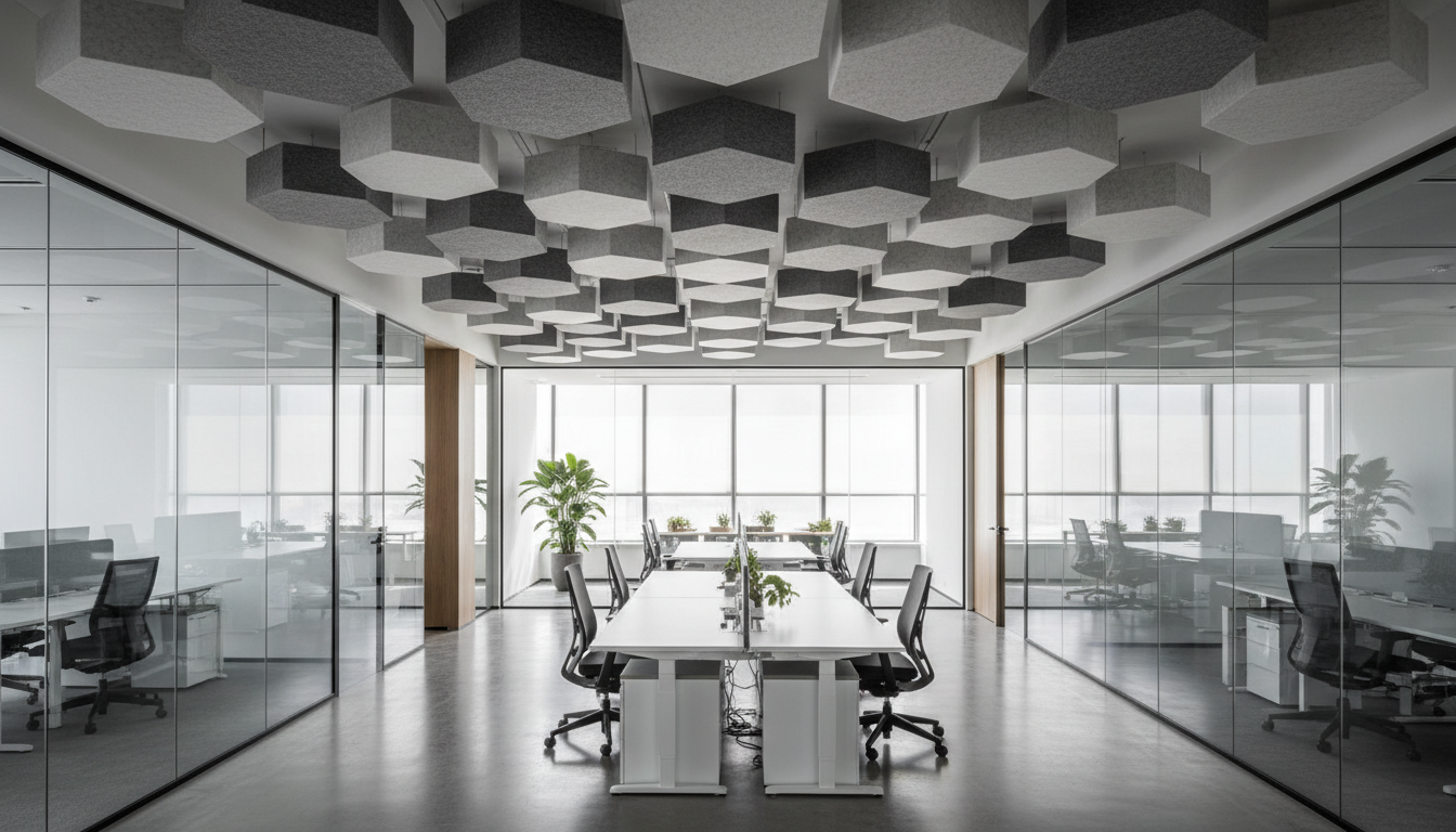
White and Gray: The Colors of Neutrality and Sophistication
White can create a sense of spaciousness and cleanliness, promoting a modern, minimalist aesthetic. Gray is sophisticated and versatile, serving as an excellent neutral backdrop that allows other colors to stand out.
- Best for: Main wall colors, providing a clean canvas. Combine them with accent colors to avoid a sterile or dull environment.
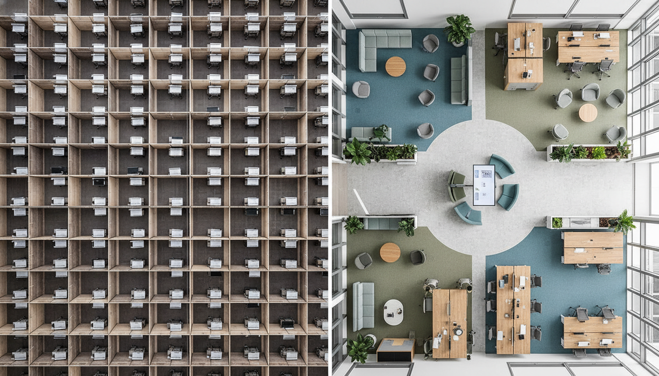
Strategic Color Zoning for a High-Performance Office
The most effective office color strategies apply different palettes to different zones based on the activities performed there.
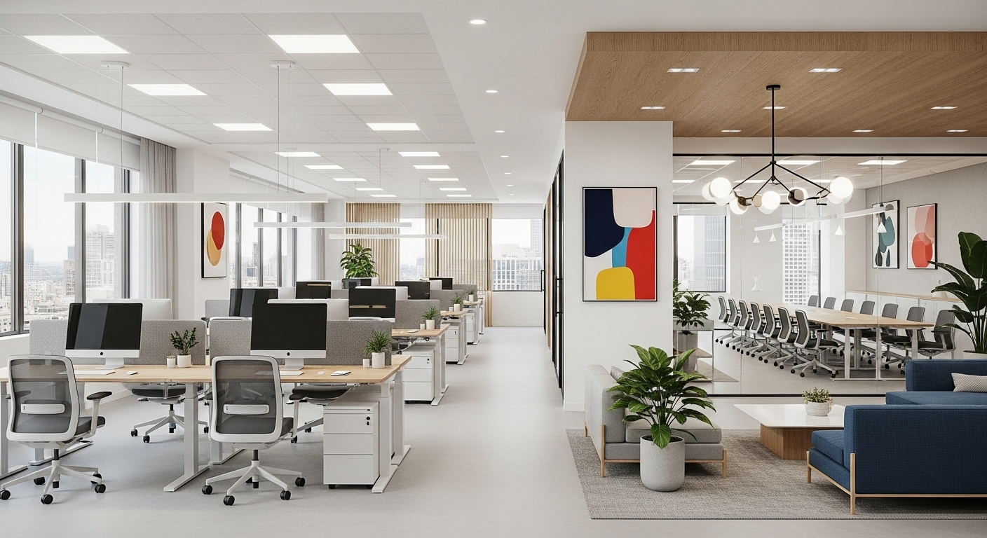
- Reception Areas: Use your brand colors to make a strong first impression. Add warm, welcoming tones like muted orange or earthy greens to put visitors at ease.
- Focus Areas & Workstations: Opt for calming and concentration-boosting colors like blue and green to minimize distractions and support sustained effort.
- Collaboration & Brainstorming Spaces: Inject energy and creativity with stimulating accent colors like yellow and orange to encourage dynamic group work.
- Breakout Rooms & Kitchens: Create a relaxing and social atmosphere with harmonious greens or cheerful yellows to help employees recharge.
Common Mistakes to Avoid
At DIG, we’ve seen how color choices can go wrong. Based on our extensive experience, here are some pitfalls to avoid:
- Over-reliance on Trends: Trendy colors can quickly date your space. It’s better to choose a palette that aligns with your brand’s timeless identity.
- Ignoring Brand Identity: Your office color scheme should be an extension of your brand. A playful tech startup and a serious law firm should not have the same color palette.
- Creating a Monochromatic Snooze-fest: An all-gray or all-beige office can lead to boredom and low energy. Always incorporate pops of color to create visual interest and stimulation.
- Using Overly Stimulating Colors in Quiet Zones: A bright red wall behind a row of desks is a recipe for distraction and anxiety. Match the color’s energy to the zone’s purpose.
For more insights, you can explore our foundational content on this topic right here: office color psychology productivity. At DIG Interior Design, we use our deep understanding of color theory and its psychological effects to build palettes that are not only beautiful but also strategically designed to enhance performance. Our services are tailored to help you make the most of every design element.
Don’t leave your office’s atmosphere to chance. Invite your NYC business to schedule a comprehensive color and design consultation with DIG’s experts and unlock the true potential of your workspace.