What Are “Hot Colors”?
Hot colors are the boldest of the warm hues — think vibrant reds, fiery oranges, electric corals, and glowing magentas. They pulse with energy, stimulate the senses, and demand attention.
Unlike traditional warm colors (like beige or mustard), hot colors aren’t subtle. They’re designed to ignite emotion, define focal points, and energize a space.
When to Use Hot Colors in Design
Hot colors can be powerful tools — but they require finesse. Here’s where they work best:
🏠 In the Home
- Dining Rooms & Kitchens: Red and orange tones can stimulate appetite and spark conversation.
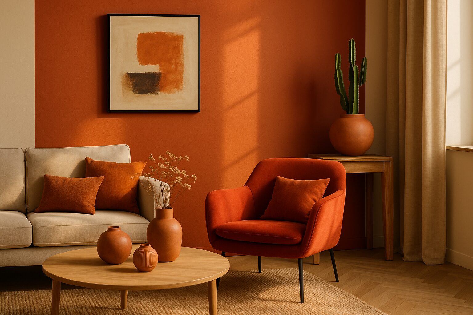
- Accent Walls: A hot coral or crimson wall can add intensity without overwhelming a room.
- Artwork & Decor: Use bold tones in accessories for easy swap-outs and seasonal refreshes.
🏢 In Commercial Spaces
- Retail Stores: Hot tones grab attention and create urgency — perfect for pop-up displays or sales zones.
- Hospitality Venues: Use them to infuse personality into lounges, restrooms, or boutique areas.
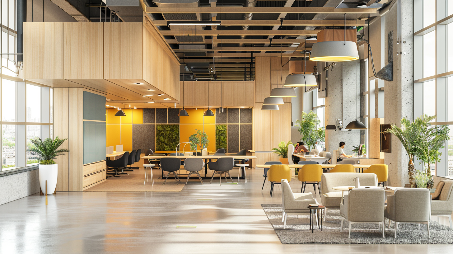
- Creative Studios: Red tones can increase alertness and passion — great for brainstorming rooms.
Tips for Using Hot Colors Tastefully
- Use Sparingly: A little goes a long way. One bold chair or a striking art piece can be enough.
- Pair With Neutrals: Anchor hot colors with black, gray, white, or natural materials to prevent visual fatigue.
- Pay Attention to Lighting: Hot tones intensify under warm lighting — which can either enhance or overwhelm depending on the space.
- Create Color Flow: Tie hot colors to other elements in the room — a rug, a trim, or accent tiles — for a cohesive story.
Hot Color, Smart Design
Hot colors aren’t just trendy — they’re expressive. When used strategically, they can amplify a brand, elevate a mood, or make a space feel unforgettable. At DIG, we help clients harness bold palettes with confidence, clarity, and cohesion.
Thinking about going bold with color?
Let DIG Interior Design guide your palette with precision and personality.
